Monday 12 November 2012

An assortment of Illustrators

Quentin Blake


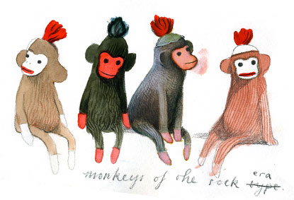
I really like Quentin Blake's work. it has a very free, spontaneous feel to it. He has wonderfull expressions to his drawing which have a very familiar, family feel to it. I grew up looking at his illustrations so they give me a very nostalgic feeling.


Alexis Deacon


The quality of Deacon's work is really lovely, i like his style of illustration, it's very gentle to look at, i like his use of watercolour with pencils.


Oliver Jeffers


The style of Jeffers characters is funny and quirky, It offers a nice quality to the viewer and would be very appealing to children.


Angie Lewlin


Angie offers a more abstrct form of illustration, she does a lot of textiles work which you can see influences her illustration, making it appear flatter and more decorative.


Tom Gauld


Gauld's cartoonist style is really appealing, it has a very imaginative quality to it, I really like the mark making within his work and I enjoy the sense of humour in his cartoons.

Thursday 4 October 2012

An assortment of photographers

Edward Muybridge


I chose this photo out of all of Muybridge's photo's because of the range of angles it give of the rider and horse. Even though you're looking at many different images, together they fit so well, as your eyes move across the images the subject moves with you, changing as though it were a stop motion film. I guess that's the magic of Muybridge, he took observational photography to a different level giving it a more fluid feel, less static.

Imogen Cunningham


This photo really caught my attention mainly because of how intimate and voyeuristic it is. The pained expression on the woman's face combined with the close position of the two people make it seem like there is an emotional back story to this photo that we shouldn't be seeing yet it's so hard to look away.
The figures are beautifully lit as well, the whole photo is a picturesque observation.


George Tice


I particularly liked the isolation of this photo, the darkness of the surrounding highlighting the car on it's lonely road. Void of detail you take in the whole photo as one and observe it's meaning or message. It's an ordinary thing that without this photo we wouldn't take any notice of and yet with Tice's help we notice the car, the long road and the mystery behind it's context.


Annie Leibovitz

There are many things that make this photo; the composition, the humor, the juxtaposition of the men and the penguins. It's brilliant and a wonderful example of Leibovitz's style of capturing the subjects characters and attitudes in a remarkable way. it's expressive and eye catching and a wonderful example of taking photography to a new, different place.


Ansel Adams


I think the thing that works with this photo is the sheer scale of it. The more you look at it the more impressive it becomes, the snow covered mountain range framing the hills which provide a backdrop for the beam of sunshine highlighting the animal in front of the trees. The whole thing has a beautiful composition that compliments the grand scale of this landscape.


Sara Moon


Sara Moon's photos remind me very much of paintings, with their soft focus and moody plays on light. This one has a sultry, feminine feel to it with it's rose colours and half clothed models. I like this style very much as i find it portraying women in a gently sexual way, classic and artistic. It certainly has a fashion edge to it as well.


Idris Khan


Friday 21 September 2012

DOF?

So this week we started photography and one of the tasks we were asked to do on this blog was to provide an example of two images; one that shows a large depth of field and one that shows a small depth of field. Even though we had an explanation in class I was still a bit confused as to what depth of field actually meant so I went home and did a bit of googling and found that in basic terms:

Depth of field is a characteristic of a camera that can be used to enhance the image composition of the photo. Depth of field means the sharp area surrounding the point of focus. The magnitude of the sharp area is affected by several factors: distance between the camera and the subject, focal length and aperture.


This is an example of a small depth of field. Only the dragonfly is in focus causing the viewer to be drawn to the main subject of the photo, this is good for outlining detail in a photo or to emphasize a certain aspect of it.


This is an example of a small depth of field. This is good for landscape or crowd images, instead of focusing on the detail you are showing the entire scope of the scene, avoiding the need to isolate elements within the image.

Tuesday 18 September 2012

A Man of Unlimited Income

 I found this beautifully written article by Gerald Rogers where he describes how he appraches being a freelance illustrator. It really cleared up a lot of confusion I originally had about what an illustrator actually did and gave an interesting explanation into how freelancers conduct business.
"There are reasons why we chose to be illustrators. We are a breed of creators, problem-solvers, and in general, visually-obsessed people. We enjoy being able to recreate the world we see in our own way, with our own hands. As kids we loved the smell of crayons, the taste of pastels, and the feel of finger-paints as we oozed them across the paper. As adults, we still do. We love the process of watching a canvas be filled with the strokes of our brushes. To us this is power."
This quote really stood out to me as it applies to all types of creative people including myself. Art, for some, is a learnt hobby, but for others, like myself, it's a living breating passion and i can feel that excitement oozing out of this article.

So yeah, I highly reccommend reading this if you have any interest in going freelance, or even if you fancy reading a pretty interesting article.

Thursday 13 September 2012

Artist spotlight


During our theory lesson as an introduction to Illustration we looked up various artists and Sara Fanelli's work really stood out for me. The thing that appeals to me about Sara's work is the inventive approach to everything from page design and typography to choice of materials.
She very much reminds me of Laura Child's work as there are many similarities between there work such as collage and a fun, doodle like quality.


"What is a scribble? Dictionaries tend to define it in negative terms - meaningless, careless, hasty - but for the illustrator Sara Fanelli the scribble has its own dynamic. "It's alive... it generates a sense of energy on the page." Scribbles occur throughout her books - urgent, angry scribbles, quiet fluffy scribbles, rhythmic scribbles and wanton, loopy scribbles. They may depict clouds, trees, wolves or spiders - or, set against the formality of the chairs and tables that seem in her drawings to represent harmony and discipline, the scribble can also be a potent symbol of merriment, disorder and high spirits." 


"Everything in her collages has had a previous life. Sweet papers are crinkled and torn, newsprint is yellowed: every mark, every stain has its own story to tell, and she interweaves these stories with her own narratives. Given a new life on the page, the often disparate and initially rather static elements of the collage take on a new significance: they may be veiled in nostalgia, they may be bafflingly obscure, but the irresistible details, the textures, the curious, often surreal, juxtapositions soon begin to reveal different layers of meaning, inviting and rewarding hours of investigation."


Before this week I had no idea what Illustration was all about, looking at Sara's work had inspired me and should i choose to specialise in it then i would love to try out some of her techniques in my own work. 


An introduction to life drawing.

First day of the course and it's a full one.
As well as all the various introductions, tutorials and an interesting lecture by Cristoph Zellweger (possible follow up post for this to come) we were introduced to the interesting world of life drawing.
As I've never done a life drawing course before i had a few apprehensions (mainly the act of staring at a naked person for hours) but mainly i was excited to get back into drawing again.
The first few drawings i did were a bit rusty but after a while i really got into it, i think this quote by Alain de Botton describes it well.
"The very act of drawing an object, however badly, swiftly takes the drawer from a woolly sense of what the object looks like to a precise awareness of its component parts and particularities." 
This applies well to the art of life drawing as instead of focusing on the entire naked image you start focusing on different parts such as the curve of the hip or the negative shapes between the limbs.
Overall I really enjoyed it and am looking forward to continuing on with it for this year.

Here's a few of the sketches I did during this first session.


A welcome.

Hi there.
Having just finished two days of Induction at Chesterfield College I'm itching to get started on the art and design foundation diploma I'm doing there, from the sounds of it we're going to be doing lots of new stuff that I've never done before.
So why the blog? Well we were instructed to create a blog to record all of our ideas and research and work that goes on during this year, an electronic diary of what we get up to you might say.
Anyway, I'm really looking forward to what this year has to hold and I hope through this blog you can get a bit of a sense of how it's going for me.
That's all for now.